Hibiscus ALH
client
Hibiscus Assisted Living Home
overview
HIBISCUS ALH aims to create a warm and comfortable atmosphere while offering a high standard of quality care. The goal of this project was to create an identity that would reflect the values of the Home.
solution
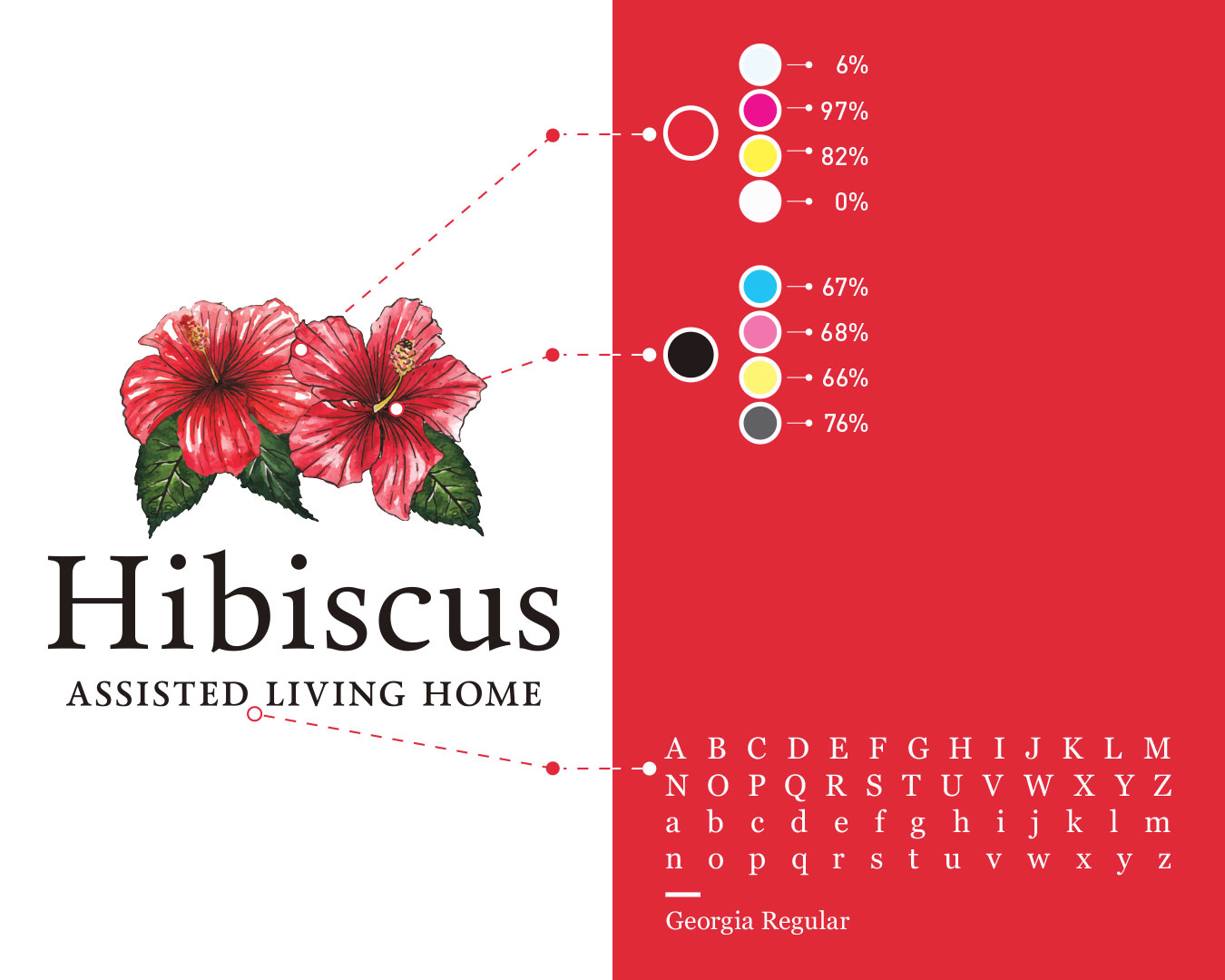
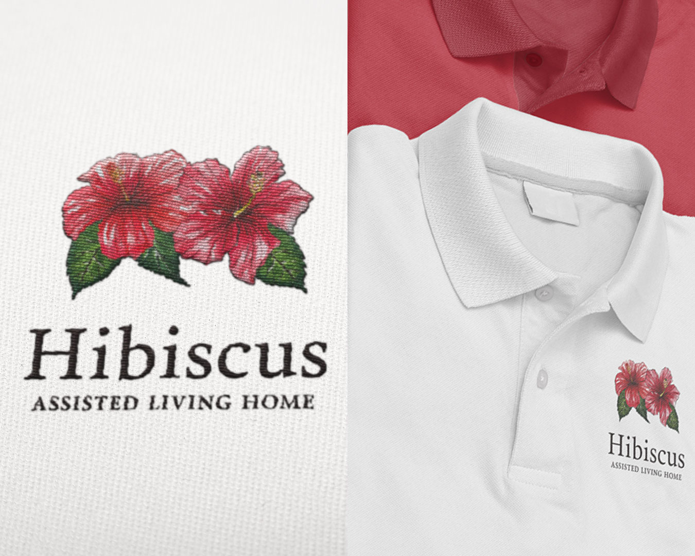
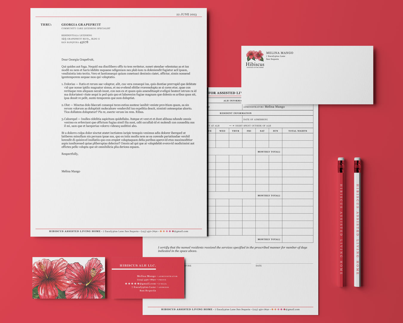
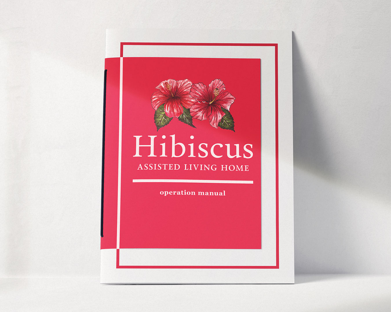
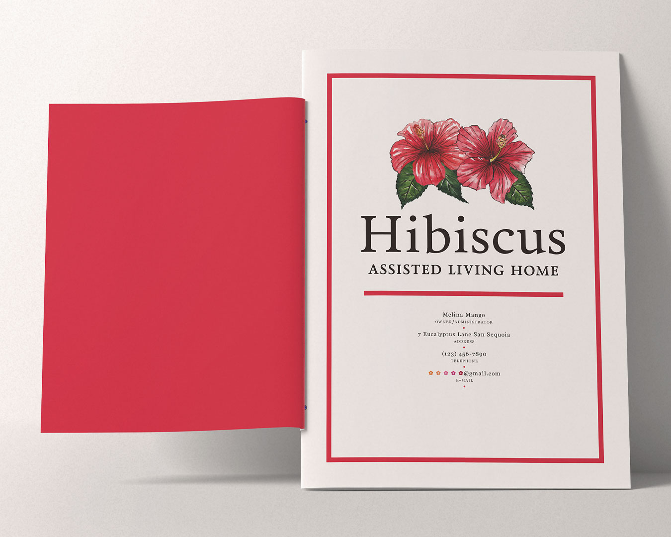
The hibiscus flower is a symbol of health, beauty, and hospitality. The logo for this assisted living home is a clean illustration paired with an elegant serif. This straightforward identity is a reflection of the Home’s desire to radiate trust and friendliness. The main color found throughout the stationery and signage is a striking red that commands attention and reflects warmth.
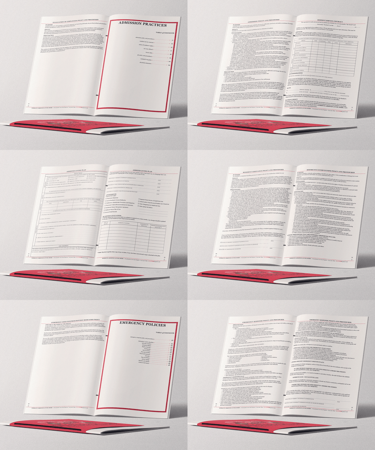
The Operations Manual and facility record sheets are dense with information, and so they were designed to follow a structured and elegant grid while maintaining the identity of clean and highly legible typography.
